Ever wonder why you crave a burger when you see those golden arches? Or why red “Buy Now” buttons make you click faster? It’s color psychology. Your brain decides about products within 90 seconds. The surprising part? 85% of those decisions are based purely on color. Before you read a store’s name or see what they sell, colors send signals to your brain. Red. Blue. Green. Yellow. This connection between colors and emotions drives every purchasing decision you make.
Smart businesses spend months choosing the perfect shade. They test combinations. They know the right color doesn’t just look good it sells. Let’s explore how color psychology affects buying decisions and your business.
The Science Behind Color Psychology
Color isn’t decoration. It’s a language your brain understands instantly. The psychology behind colors in marketing reveals why certain shades trigger specific responses
Research shows colors increase brand recognition by up to 80%. Customers forget taglines and names, but they remember colors.
Here’s how it works: Your brain processes color before words or shapes. It hits your limbic system controlling emotions and memories.
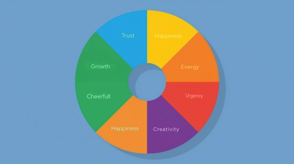
Understanding colors and emotions is fundamental. Red increases heart rate. Blue calms you. Yellow grabs attention. Green suggests health.
The Power of Color in Brand Identity
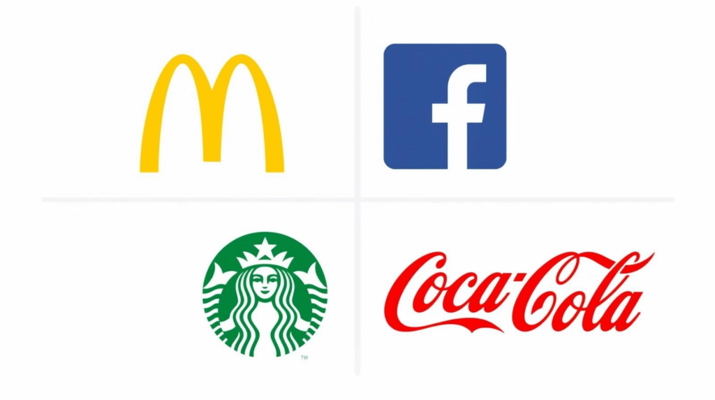
McDonald’s didn’t randomly pick red and yellow. Facebook didn’t accidentally choose blue. These companies invested serious money into understanding the psychology of colors in marketing. Studies reveal 92% of consumers say visual factors matter most when buying. Color is the biggest factor. Take McDonald’s. Bright red stimulates appetite and creates urgency. Cheerful yellow signals happiness and is the most visible color in daylight. Result? You spot those golden arches from miles away. Your stomach rumbles before you pull in.
What Different Colors Mean for Your Business
Red: Urgency and Action
Red is the power player. It increases heart rate, creates excitement, and triggers appetite. That’s why clearance sales use red tags.
- Brands using red: Coca-Cola, Netflix, Target, YouTube
- When to use it: Sales, food brands, calls-to-action, creating urgency
Blue: Trust and Stability
Blue represents reliability, security, and professionalism. Banks and tech companies love blue because it builds instant trust. It has a calming effect that makes people feel secure.
- Brands using blue: Facebook, PayPal, IBM, LinkedIn
- When to use it: Financial services, healthcare, technology, professional services
Learn how our social media marketing services can strengthen your brand presence.
Green: Health and Growth
Green connects with nature, health, and sustainability. It signals freshness and growth. In 2025, green has become crucial as consumers prioritize environmental consciousness.
- Brands using green: Starbucks, Whole Foods, Tropicana, Spotify
- When to use it: Organic products, environmental brands, wellness businesses, sustainable brands
Explore our graphic design services to create visually compelling brand materials
Yellow: Optimism and Energy
Yellow grabs attention fast. It’s optimistic and cheerful. Yellow is the most visible color in daylight, which is why it’s used for traffic signs.
- Brands using yellow: McDonald’s, IKEA, Snapchat, Best Buy
- When to use it: Drawing attention, youth-focused brands, creating happiness, budget-friendly positioning
Orange: Confidence and Friendliness
Orange combines red’s energy with yellow’s friendliness. It’s playful and approachable. E-commerce brands love orange because it encourages buying without feeling pushy.
- Brands using orange: Amazon, Fanta, Nickelodeon, Firefox
- When to use it: E-commerce, entertainment, impulse products, action buttons
Black: Luxury and Sophistication
Black screams premium. It’s elegant, powerful, and exclusive. Black creates mystery and makes products feel more expensive and desirable.
- Brands using black: Nike, Chanel, Apple, Gucci
- When to use it: Luxury products, premium services, sophisticated brands, high-end fashion
Our website development services incorporate color psychology for maximum user engagement.
White: Simplicity and Clarity
White represents purity, cleanliness, and minimalism. Tech brands use white to signal innovation. Healthcare brands use it to convey sterility.
- Brands using white: Apple, Google, Tesla, Adidas
- When to use it: Healthcare, beauty products, tech brands, minimalist design
Purple: Creativity and Royalty
Purple balances power and wisdom. It’s creative and luxurious. Purple is rare in nature, making it feel special and unique.
- Brands using purple: Cadbury, Hallmark, Twitch, FedEx
- When to use it: Beauty products, creative services, premium brands, wellness brands
How Color Combinations Work Together
Single colors are powerful in marketing. But colors in marketing psychology work even better when combined strategically.
Red and yellow together create urgency and happiness perfect for fast food. Blue and white build trust and cleanliness ideal for healthcare.
Customers associate specific color combinations with feelings:
• White + Green + Blue = Trust and freshness
• Black + Green + Blue = Security
• Red + Yellow = Speed and excitement
• Black + Gold = Luxury and exclusivity
Your color combination should tell your brand story instantly. High contrast combinations grab attention. Low contrast feels sophisticated but can be harder to read.
Choosing the Right Colors for Your Business
Start with your brand personality. Effective psychology of color in marketing starts with your brand personality. Are you professional or playful? Luxurious or affordable?
Consider your industry. Tech companies use blue for trust. Food brands use red and yellow for appetite. Health brands choose green for wellness.
Think about your target audience. Age, culture, and gender affect color preferences. Younger audiences prefer brighter colors. Older audiences prefer muted tones.
Test your colors. A/B testing shows that even small changes boost conversions. One study found that changing a CTA button from green to red increased clicks by 21%. Pair strategic colors with our SEO services to increase visibility and conversions.
Common Color Mistakes to Avoid
Understanding the psychology of colors prevents costly mistakes. Don’t follow trends blindly. Choose colors that will represent your business for years.
Avoid too many colors. Stick to 2-3 primary brand colors. More creates confusion.
Don’t ignore cultural differences. Red means luck in China but danger in Western countries.
Never sacrifice readability for style. If text doesn’t contrast with background, people won’t read it.
The Future of Color in Marketing
In 2025, AI tools test color combinations and predict emotional responses. Brands optimize colors continuously.
Sustainable and natural color palettes are trending. Earthy colors convey authenticity.
Digital accessibility is changing how brands think about color. Higher contrast and thoughtful combinations ensure everyone can engage.
Color remains one of the most powerful marketing tools available. Our web design services incorporate the latest color psychology strategies for maximum impact.
Final Thoughts
Color psychology in marketing isn’t just theory it’s proven strategy. The right colors boost brand recognition by 80%, influence 85% of purchase decisions, and increase conversions significantly.
McDonald’s red and yellow make you hungry. Facebook’s blue makes you trust them. Starbucks’ green makes you feel good.
Every color sends a message. Every shade tells a story. Every combination creates an emotion.
The question is: what story are your brand colors telling?
Ready to choose colors that actually convert? Binary Only’s design team understands the psychology behind every shade. We help businesses create visual identities that sell.
Contact Binary Only today to discuss your brand color strategy.
Frequently Asked Questions (FAQs)
Q: How long does it take to rebrand with new colors?
A complete color rebrand typically takes 3-6 months, including research, testing, and implementation across all touchpoints. However, digital changes (website, social media) can happen within weeks, while physical materials (signage, packaging) take longer. Start with high-impact digital assets first for quicker results.
Q: Should startups worry about color psychology from day one?
Yes. Changing colors later confuses customers and weakens brand recognition. Choose strategic colors early, even if your logo evolves. Your initial color choice shapes how customers perceive your brand’s personality, pricing, and values from the first impression.
Q: Can I use multiple brand colors or should I stick to one?
Use 2-3 primary colors maximum. One dominant color (60% usage), one secondary color (30%), and one accent color (10%) creates balance. Too many colors dilute brand recognition. Think Coca-Cola (red + white) or Spotify (green + black) simple and memorable.
Q: Do color trends matter, or should I ignore them?
Choose timeless colors that align with your brand values, not fleeting trends. However, you can incorporate trend colors through seasonal campaigns, limited editions, or accent elements while keeping your core brand colors consistent. Your main colors should work for 5-10 years minimum.
Q: How to use color psychology in marketing effectively?
A: Start by understanding your target audience and brand personality. Choose 2-3 primary colors that align with your brand message – blue for trust, red for urgency, green for health. Test color combinations on your website and marketing materials. Use contrasting colors for call-to-action buttons. Review competitor colors to differentiate your brand. Monitor analytics to see which colors drive better engagement and conversions.